Archive 05 ・ Open fileArchived case study ・ Concept app ・ 2022
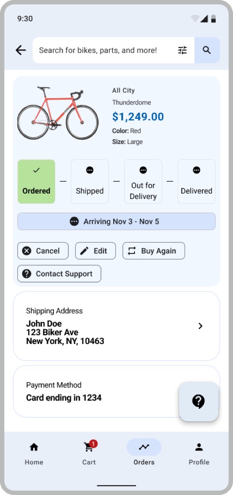
Just Bike It
A bike shop app that knows your height. Pick a bike that actually fits, get it delivered assembled, and know exactly where it is.

- When
- March – July 2022
- Role
- Lead UX researcher, lead UX designer
- The work
- User research, wireframing, prototyping
- Built in
- Figma
The monsterThe problem
Customers of a New York bike shop were struggling with the whole journey: choosing a bike, ordering it, and finding out when it would arrive. I designed a mobile app to fix that end to end, then tested whether choosing and ordering a bike really felt easy.
The scouting reportResearch
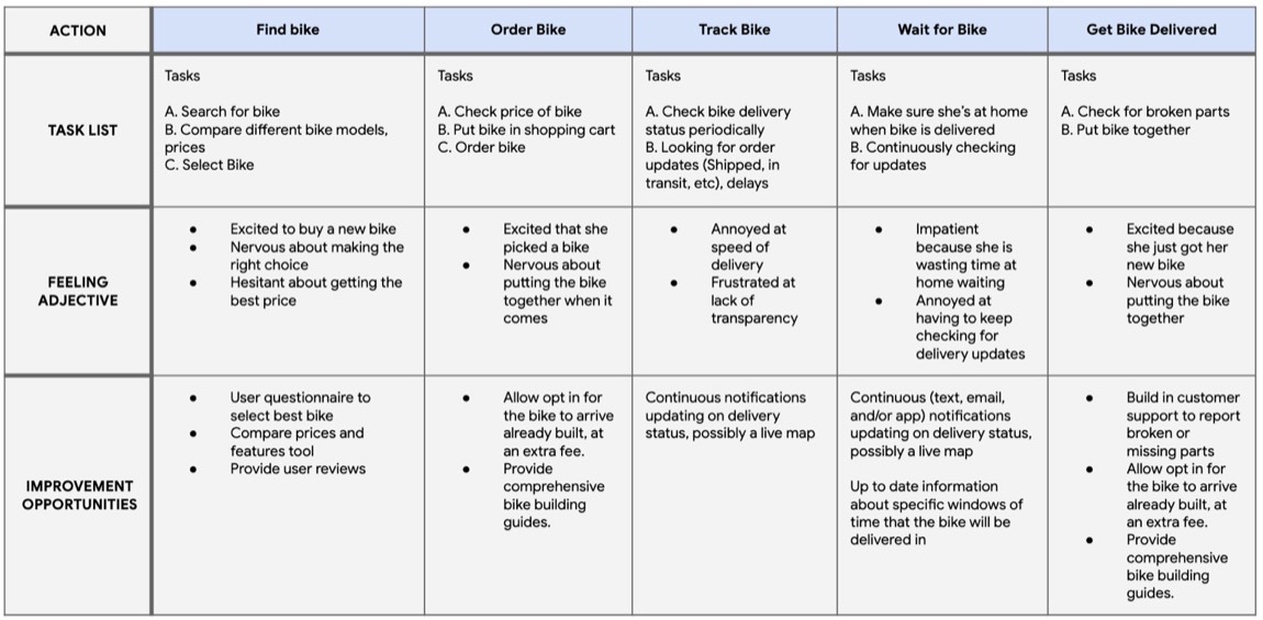
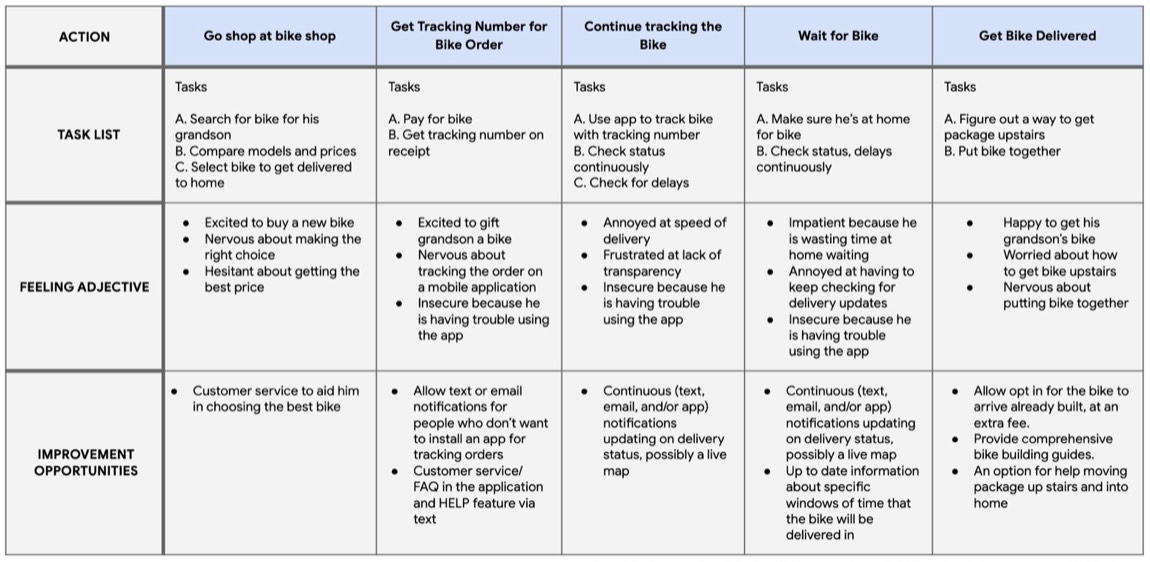
I interviewed five cyclists, found through Strava, about buying bikes online. Saving time and live tracking came up, as expected. The more interesting problems were anxiety and access.
- Time. People spent too long chasing down their orders.
- Accessibility. The existing app wasn’t simple enough for less tech-savvy customers.
- Sizing. Picking the right frame size is nerve-racking, especially when you can’t try it first.
- Disabilities and limits. Heavy boxes, walk-up buildings and difficult assembly put some people off ordering at all.
Rita
Health and fitness writer ・ 25 ・ Boston“Bike sizes are confusing. What is the right size for me?”
Avid cyclist, new bike every five years or so. Wants live updates on her order and to hear about delays straight away.

Lars
Retired teacher ・ 67 ・ Salt Lake City“Tracking an online order shouldn’t be rocket science.”
Buying a bike for his grandson. Not comfortable shopping online, has trouble with small text, and lives up three flights of stairs.
The game planSketches and wireframes
The puzzle: build body measurements into shopping without making them the whole experience. Small filters felt right. I sketched five ideas, refined one, and went with a simple list of bikes.
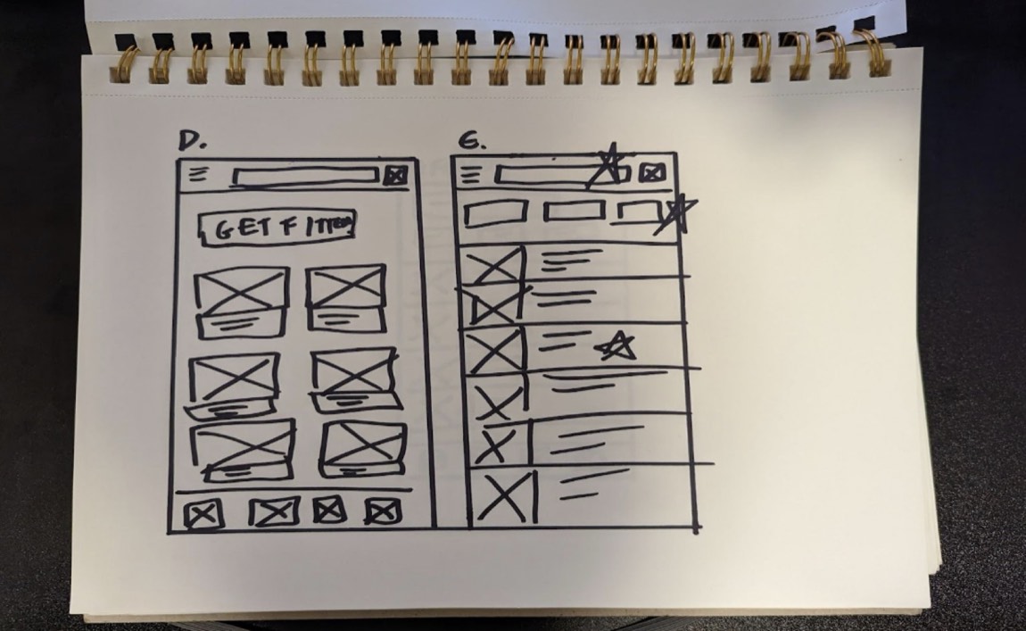
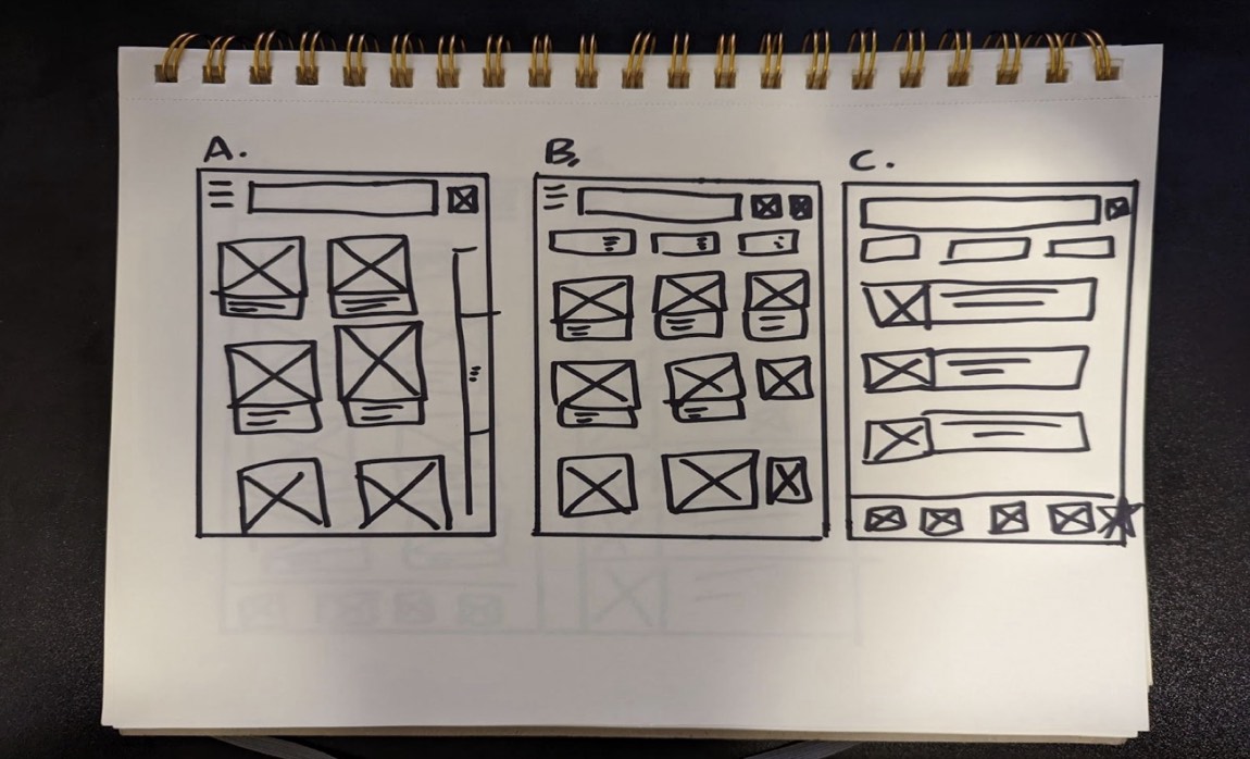
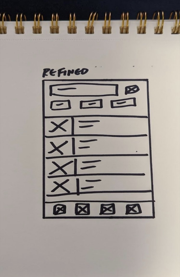
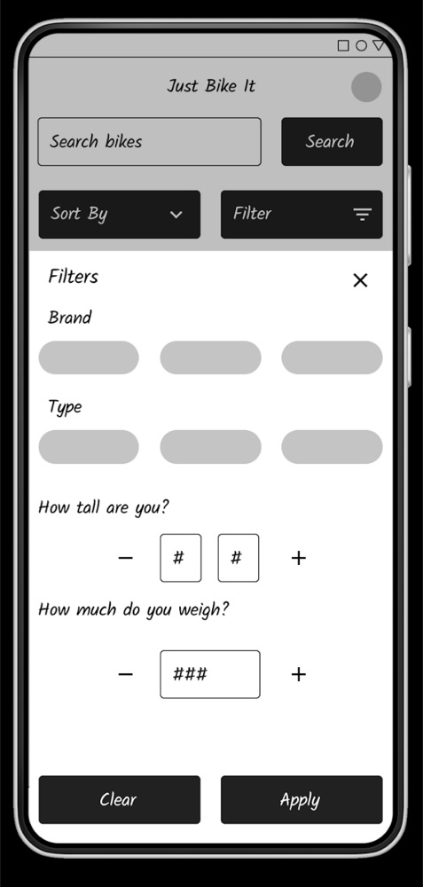
In Figma, filtering was everything. Brand and type, as you’d expect, plus height and weight, so you only see bikes in your size. Then a low-fidelity prototype: filter, choose, confirm, check out, track.
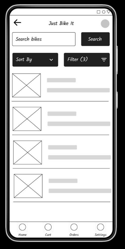
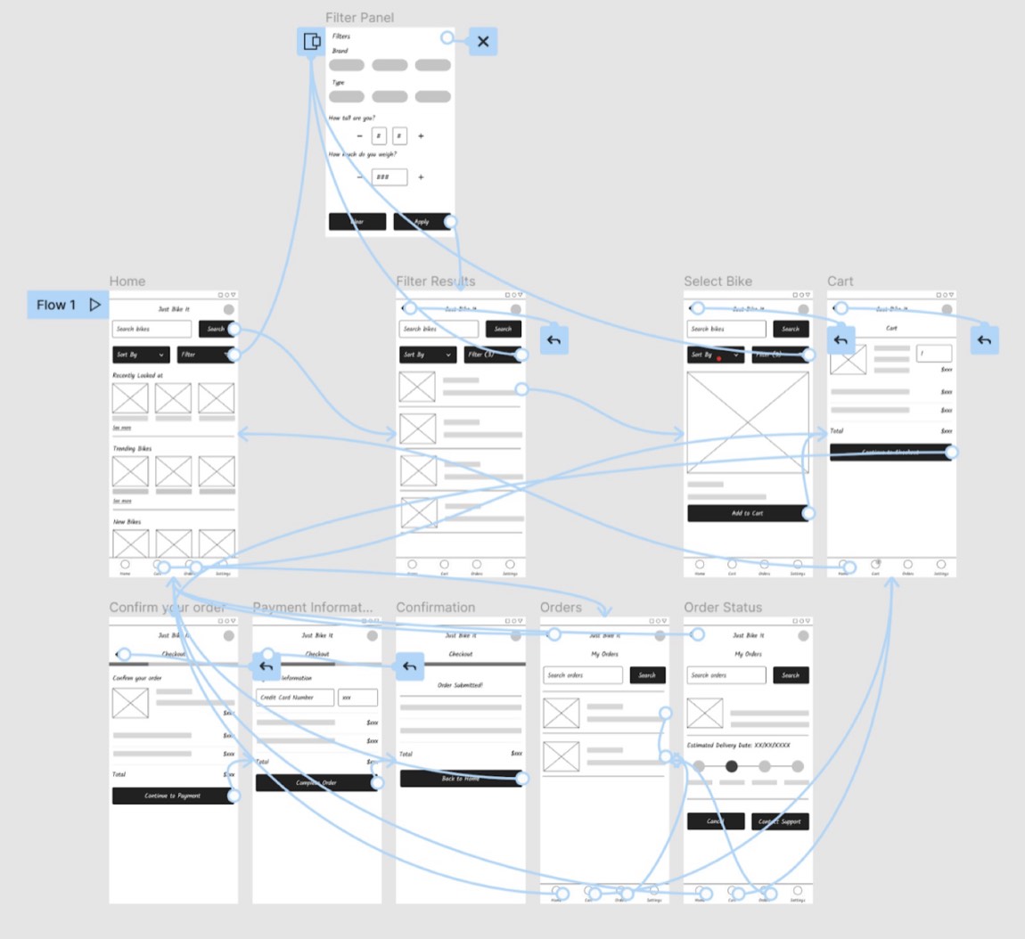
Testing it with the same five people turned up three things:
- Confirm before you pay. They wanted a clear confirmation screen before entering card details.
- Easier measurements. They liked the fitting idea but wanted a simpler way to enter their size.
- Real support. A “Contact Us” link wasn’t enough.
The punchThe final design
The loading screen is my favourite bit: while it loads, a cyclist rides across the screen and you get a tip, like “stay hydrated” or “always wear a helmet”.
Checkout comes in clear steps, with a proper confirmation screen and every price laid out. You can choose to have the bike delivered fully assembled.
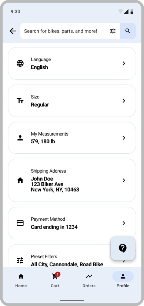
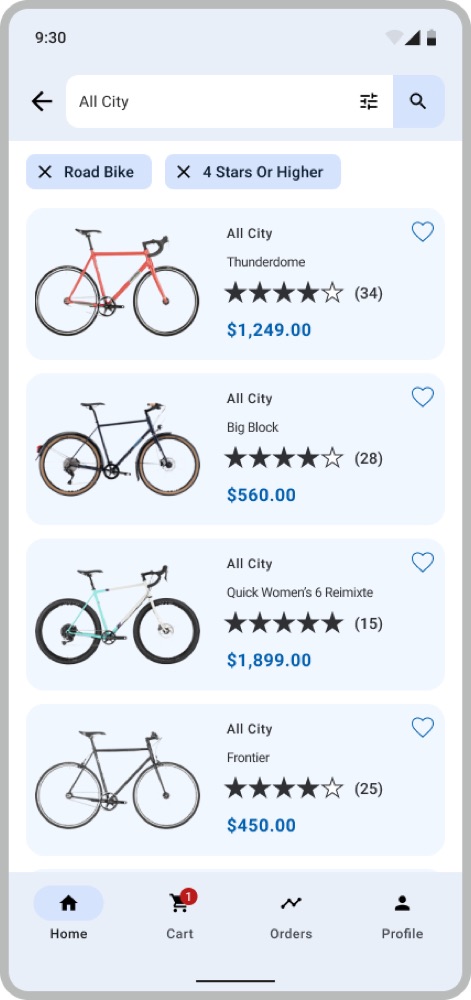
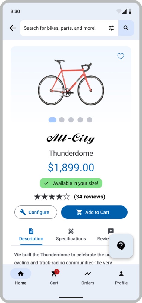
Then the good part. Save your measurements in your profile once, and you can choose to only see bikes that fit you. Testers loved it: it gave them real confidence buying online. You can also set your language and permanent filters.
The aftermathOutcome
Testers were positive about the app overall, and especially about fitting. Knowing a bike would fit before it arrived made buying one online feel safe.
The biggest lesson was who to talk to. Interviewing a 67-year-old who struggles with technology is what made the anxiety about assembly, and those three flights of stairs, real to me.
RematchWhat I would add
Three things. Bikes for people who can’t ride a standard one, like recumbents for riders with back pain. An optional bike-builder wizard, from “How tall are you?” to “Will you be riding with a child?”. And more than one set of measurements per account, so a parent can shop for their kid too.